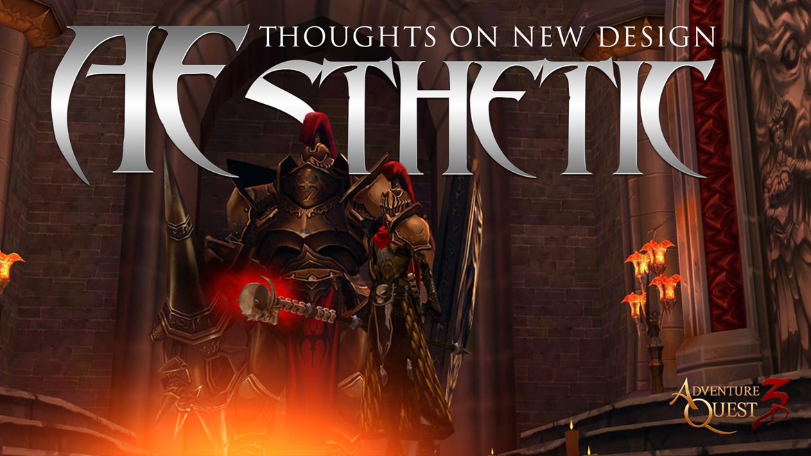

The App stores and Steam are all doing a round of "brand refreshes". Which means, it is a good time for us to do the same. As we preparing to make some big design related decisions... I would LOVE to get your 2 cents (or is it gold for us) on the subject.
Our box art, promo images, and art tends to sway very heavily to the extremes of light and dark. You can also see this in AdventureQuest 3D's areas. The Town of Battleon and Greenguard are bright and happy. The forest of DoomWood and Ashfall are dark and filled with doom. Personally, I have always been pulled between these two extremes. I like that the town of Battleon is warm and happy... because that is the place I want to come home too. However, it is the dark, skull, and shadow filled places that stir my hunger for adventure. In art... there really is now right or wrong. There is simply... your taste and preference. Today's discussion will be heavily centered around your tastes.
All the app stores and steam seem to be changing their icons, headers, and, well, the default sizes of everything to make them more modern. Since I will be creating new assets for these anyways... thought AdventureQuest 3D's website might benefit from some freshing up too. It has been a very long time since I put together our current homepage with Miko. But then I hit that wall... should it be light, or dark?
The best place to start is with AdventureQuest 3D's Box art. All games feature the logo. (That one is easy.) What remains is some art to give a feel to the game. Our current box art features Artix, Robina, and Twilly flying at the camera from Greenguard forest. I am tempted to do something darker. Vane is on our title screen when you load the game. Possibly... too dark. Or we could do something heroic or funny. What do you think the right "feel" of AdventureQuest 3D should be. Can you describe the PERFECT box cover? Before you try... let me share with you the things I have been thinking about.
Should we show off the games villains, NPCs, or heroes? The villains make a lot of sense. They are your goal after all. But if you are opening this game every day on Steam... maybe it would be nice to see some friendly faces welcoming you back. I am a fan of a "Trilogy of Heroes." That is one guy, one girl, and one "other"... which can be a monster, moglin, or just a larger hero.
The post of the characters is more vital than the characters themselves. Are they stoically staring at you, in a battle pose ready to fight, or doing something that inspires a chuckle or warm smile? Or do you put an attractive character on the cover with a super smexy-pants pose?
Yes. The answer is almost always yes on this one. Unless the character on the box is staring stoically off at some floating castle thing (which apparently wins you a game of AE villain bingo). I noticed a long time ago, that movie posters (box art) that have characters looking right at you make you look right back at them. In fact, it seemed the more zoomed in the character's face is the more the eye caught your attention. Perhaps it is our natural response to just look back at people who are looking at us. If they are a mean face, we subconsciously feel like they are possibly a threat. If they are smiling at us.. it makes it us feel good. (This is why I never change my smiling Avatar on Twitter by the way... I always want you to feel good.) What sort of pose best gives the feel of an AdventureQuest game?
Light or Dark? The background pretty much sets the mood for the entire box art. A group of heroic looking characters in a dark place creates a feeling or danger and adventure. A super skull and spike covered evil villain standing in a magical unicorn rainbow forest makes you feel.... sorta weird. For the background I tend to be polarized between two options... a bright and beautiful greenguard, or a opressingly dark and doom-filled DoomWood. But there are always other options. What background best gives the feel of an AdventureQuest game?
Ok... this is only "slightly" different than pose. Not every box art has a situation. Some literally just have a close up of the main character's head. But we have a few million main characters. #MMO_World_Problems . To create a situation would be like the login screen where Galanoth was facing off against a half dozen dragons in "hero landing pose". We are huge fans of parody... which is lightheartedly spoofing things from pop culture with our characters. We have many times thought of ourselves as the fantasy video game version of Family Guy TV show. Should there be a situation on the AdventureQuest 3D box art that gives you a sense of the game? Should it be a serious, epic, or funny situation?
It would have been easy for me to send some of my infamous stick figure scribbles to Dage and asked him to create a cover based on them. But I thought you might like to be involved in this conversation. It is a big one. What we ultimately go with with be something people all over the world see first when looking at our game. It is a pretty big deal. Glad to have you thoughts on it.
Let me know what what kind of Box Art would fit AdventureQuest 3D in the comment section below. Looking forward to talking with you about it. Battle on!
P.S. Today's screenshot from @JusticarLuna
Official Twitter of AQ3D
Pun-slinging Paladin
Undead Legion Ruler
Scribble Scribe
Dawnforger