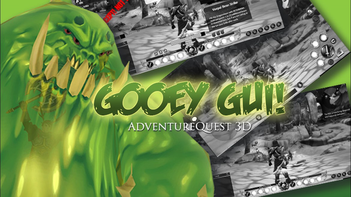

If you only played on one, or never noticed, AdventureQuest 3D has a completely different graphical user interface (GUI) for computers and hand held devices. In the interview/survey, a lot of you wanted improvements like an improved PC interface, numbers on the health bars, a loot button, potions on the main interface, hotkeys, and more. We have been listening and taking action, so....
PanicPop and I fired up Photoshop and made some mockups to see how we could make it work. These are sorta "a wee more than just wireframe mockups". Which means they may sorta look real, but they are not. In fact, I am getting angry messages from the team right now for daring to show you such raw and unfinished graphics. But I know you can handle those expertly drawn squares I used to represent the chat box :P

"Turn on all the things!"
In this mockup we have everything turned on. There are room for 10 buttons which can include potions, travel forms, emotes, and of course your class skills. At the bottom left there are 6 small buttons for options, interface, map, news, etc. I personally like how the faceplate becomes a centered and iconic part of the interface. The War Meter is moved above the chat box here-- but not sure how that will work as we want to let you change the size of the chat box. Guess we could anchor it. Also I demonstrated how chat bubbles could be used. We would need toggle buttons for most of these things in the games options menu.

Remember, this is just a mock up-- none of this art is final. We just moved things around and slapped graphics on for placement purposes. If you like this, we will move forward with it. Also.. Hotkeys. HOTKEY FOR ALL THE THINGS!

"OMG! Is that a loot button in the middle left?"
First thing I did was move the attack & skills buttons further from the edge. It may not look like much in the mock up, but it is a HUUUUGE difference. The jump button will not be a lot easier to hit. Oh, remember how we have 10 buttons on the PC version? You will on the mobile version as well. See that little curved arrow button to the right of the attack button? That lets you toggle between the current four skills, and 4 more. Additionally, added quick use buttons for travel form and potion right at the bottom of the screen. The new chat button on the left should be self explanatory. By having that button, we can make clicking on the chat box itself option up an options panel to change how you chat (sorta like how the PC version has tabs.)
Why are the Mockups Black & White?
Great question! I made them grayscale so you would focus on the composition, not the nicky picky detail stuff like color or texture. We can do that stuff next.
How to customize the bars
On PC, the left hand bar is for your class skills and the right hand bar is customizable. Initially I wanted to have fixed slots for your actively set Potion, Travel Form, Emote, and other things. But a lot of people want full customizability. Drag-n-drop is an easy solution for the PC, but not as much for mobile because the interface that displays these things covers the attack buttons. One solution is to make fixed slots for mobile, and make the same spots "recommended" for PC but you can override that and put whatever you want there.
The Mini Radar
We are working on a World Map. Many players on Twitter noted that the radar on the PC version did not seem helpful enough to justify the space it is taking up. So we should probably remove that and instead add a smarter way to see when enemies are nearby.
UI Scaling & Transparency
These things seem like a good idea for PC... agree?
DEATH
I would reaaaaaallly like Dage to paint the Grim Reaper so we can have him physically appear on the interface when you die with a randomized "death message". Death can also let you know why it takes longer to respawn in dungeons or why in extreme challenge modes, you are not allowed to respawn unless either your party beats the current room, or someone uses a res ability on you.
Tiny Artix in the bellow of the Slime Monster
Did you notice it in the header image? :D
Comment below and let us know if we are on the right path. Meanwhile, the programming team has made massive action on their list and we are closing in rapidly on Ashfall-- the remaining cutscenes being the biggest and most important thing to complete. (I know, I still gotta get that Game Plan page posted!)
Official Twitter of AQ3D
Pun-slinging Paladin
Undead Legion Ruler
Scribble Scribe
Dawnforger