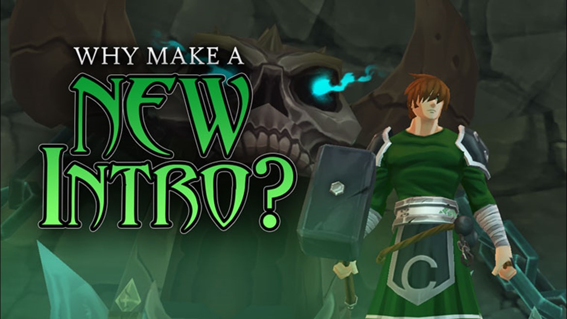

We've already got an intro in AQ3D, so why spend valuable development time and resources on another? Well... why do you build a new anything? It's usually because the old one doesn't work.
The mobile market is a TERRIFYING place for developers. I mean Makes-P.T.-Look-Like-Care-A-Lot kinda' scary. There are more free-to-play games than you can shake a shark at and the number is increasing rapidly so it's very easy to get lost in the noise and lights. As a mobile game dev, you only have about a minute and a half of gameplay to capture someone's attention enough for them to want to open your game a second time. Otherwise, they delete and move on to the next game and you're ghosted.
Every.
Second.
Counts.
Getting things wrong is amazingly instructive, as long as you never quit trying to improve.
When we first built the current intro, we were missing a lot of functionalities that we later added to the game. We would go back and make changes to the quest flow or dialogues or add some markers to let us know how many people were making it all the way through the tutorial to Battleon.
How many make it? Not enough.
But that's OK. This is why we are still in Open Beta. We know we'll never be perfect, but we'll always keep trying to get better. We work every day to improve this game and we don't plan on stopping.
One of the issues with the current intro is that it's just too bloody long. As much fun as it is to meet Twilly and save Gramps and Sally and learn about Guardians and meet Gaz and face down the hulking monster in the keep... it's a lot to take in for an intro and tuorial.
Another huge issue is that it doesn't get you invested in the world. Once you solve the issue and get to Battleon... It feels a like chapter ending. It's a great place to call it a night and close the game. It doesn't pull you on or give the player a reason to join the world beyond the story they just completed.
First, it's much shorter. There's a lot less running and we condensed the dialogues into short, pithy scenes that will hopefully get a few chuckles and make you want to see what comes next.
Next, we give you a reason to keep going. You're immediately given a task that you can't complete in the intro. This has to do with the AQ3D main villain, Overlord Vane, and DEATH.
A whole lot of AQ3D is about fighting monsters so getting right to the action is a really good move. We get you into a fight, right off the bat. You get in and start swinging (or casting, or stabbing) well before you talk to ANYONE.
Finally, we aim to give new players much better instruction to help them into the game. You would be amazed how many people we handed the game to who just pointed the camera up and started spinning in circles. One major improvement is now telling new players to follow the quest arrow which is a KEY element to the game's UI that we never tell you about in the current intro.
Remember when I said that we only have a few scant seconds to grab someone by the face and make them love AQ3D (or at least think it's fun/funny/interesting enough to come back to)? That means we have to make this slick, fun, and damn near perfect. We can't afford some weird quest bug that we missed because we were on a tight deadline and didn't test enough.
If we can nail the intro, it'll give us a big reason to go back, re-write, re-do, and clean up our older areas like Heartwood, Livingstone Caverns, Doomwood and the Bone Cliffs.
Every game plays differently but we want to know what game intros stuck with you, even if there's no way we could apply what they did to AQ3D.
What was a game intro that grabbed you right away and gave you that itch to see what comes next?
Official Twitter of AQ3D
Pun-slinging Paladin
Undead Legion Ruler
Scribble Scribe
Dawnforger